Evolution of a Data Story: The Role of Iteration In Strategic Data Visualization
- Roseanna Galindo, CCBA, CAVS
- May 5, 2023
- 7 min read
Updated: Dec 31
Looking for a more current perspective? You may also want to read my recent article on iteration in data visualization, which explores how iteration supports clearer decision-making and data storytelling.
Data storytelling resides at that Venn diagram intersection sweet spot in the middle of data, visualization, and narrative. Done well, data storytelling distances itself from data showing and data sharing by weaving elements together in such a way as to deliver context and key insights to compel data-driven decision-making. Getting that message across in the most effective manner requires embracing the iterative process.

In this post I’ll identify the steps to creating an effective data story, discuss the iterative nature of data storytelling, and identify what threatens the iterative process from readily occurring. A case study example at the end provides an example with six iterations of the data set in use.
STEPS TO CREATING AN EFFECTIVE DATA STORY
Data storytelling is audience-centric and driven by your purpose. The visualization process for your data story will be guided by the business question you are asking of the data and stakeholders to whom you plan to share it.
Gathering, selecting, and organizing the data for analysis is the next step. Once you have clearly defined your purpose, you can turn your business question into something that you are able to measure, observe, or quantify.
Creating visualizations is next up in the data story process. Data visualizations are the graphic representations of the data. I think of the data as the letters that make up a language, the visualizations as the words and phrases, and the data story as the narrative aggregate that they create.
Just as sometimes the right word conveys a specific meaning to an audience, so can the selection of the “just the right” visualization. Selecting the most effective visualization tool, eliminating clutter, and adding design elements to emphasize the key takeaway are the basic essentials of creating an effective data visualization.
I think of the data as the letters that make up a language, the visualizations as the words and phrases, and the data story as the narrative aggregate that they create.
This step, the visualizing of the data, is actually the same step repeated over and over if done correctly. Only once you have gone through several iterations of your visualization should you start developing the final versions (plural) of your data story. Iteration is integral to developing the data story that you plan to share with your audience.
THE ITERATIVE NATURE OF DATA STORYTELLING
The act of iterating – intentionally repeating or performing a process or procedure – forces you to gain a new perspective of ways to visualize your data by applying different views. Iteration is typically engaged in as a means of obtaining successively closer approximations to the right answer. In the case of data visualizations, replicating the process of looking at the data, selecting a tool, and designing the story chart, is a means to get the right answer by having a choice of variations that can be field tested for feedback.
I recently had the opportunity to present "Data Visualization Essentials" workshops for leaders in healthcare at the California Hospital Association’s Healthcare Volunteer Leadership conference and at the Beryl Institute’s Elevate PX in Dallas. At both conference sessions, I was peppered with questions about selecting the “right” tool.
The correct answer is that there is no one ‘right’ tool because the right tool will always be the one best suited for your purpose and audience, as well as your data. However, there are more or less effective tools to explore as you develop different iterations of your data story.
THREATS TO THE VISUALIZATION ITERATION PROCESS
While it is best practice to develop multiple views of your data, the reality is that this step is often glossed over or avoided in favor of going with the first visualization out the gate. There are a several barriers that impact following through on this critical step in the data storytelling process.
Time. The number one reason iteration does not occur is simply time. It is easy to go with one and done.
Ownership. Relatedly, the time invested in the creation of the initial visualization can overly effect creator attachment to it.
Unfamiliarity. Lacking familiarity with the types of charts and graphs available is another barrier to iteration. If you are unfamiliar with how and why a particular tool should be used, you are not likely to work with it.
Fear of failure. Iteration requires potential failure. Embracing iteration means releasing pressure on yourself to have a perfectly designed solution on your initial attempt. Some of your visualizations may miss the mark entirely when tested.
This last one is bigger than you would think. Most of us are not professionally comfortable with not being able to produce the "right" answer. Innovation and creative energy can be stymied by this and data storytelling is a creative expression of data.
Have you heard of The Marshmallow Challenge? It is an exercise made famous by Tom Wujec in a Ted Talk . It is a facilitated group exercise in design, innovation, and prototyping. And what it shows time and again is that Kindergartners perform better at the iterative process than MBA’s. Why? Because the latter feel like they must have the correct solution before even making an attempt whereas the littles just start playing with design immediately.
LET’S ITERATE: A CASE STUDY EXAMPLE
The following table shows the year-over-year growth rate for active volunteers in a nonprofit organization. Suppose we have been asked to share the current health of the growth rate compared to its average with our executive board. The data can be shown in many ways. I immediately think of two, a heatmap and a line graph, but I want to make several more for iteration’s sake. In fact, not risk-averse overachiever that I am, I make six.

Heatmap Table
One of my first thoughts is to keep the data in a table and use a heat map to show the relative hot and cool periods of growth. I like the look of this and you can quickly see peaks and valleys, but the average gets lost.

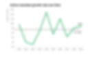
Line Graph
My next thought is a line graph because this is a trend over time. I increase the weight of the end point marker and am able to clearly note the compared average. This visualization also gives me a lot of white space for additional storytelling annotation if needed.
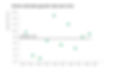
Scatterplot
I use a scatterplot to see if the relationship between the two variables gives me any additional insight. I add the average with a dotted line which allows me to see where the growth rate has been above or below it. While I do feel that this chart provides a good expression of the up and downs of the numbers, I don’t think it shows a good comparison, which is what was asked.
Simple Text
We are only talking about a few numbers, so I try simple text as the visualization. It is clean and clear where our growth rate is compared to the average, but I feel like too much of the context has been lost to make it meaningful.

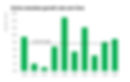
Vertical Bar Chart
I visualize the comparison between years with a bar graph. I thicken the bars to minimize the space in between them and add an average line. There isn’t a lot of white space left for further annotation, but it does a nice job of showing our highs and lows.
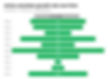
Funnel Chart
Finally, I create this one because it is actually suggested by Excel in the chart function. I am not too familiar with funnel charts but I like the way that the accordion nature of the growth pattern is clearly visible. It is hard to make the average stand out for comparison. Despite that, I kind of like it. If I could merge the heatmap table idea with these funnel bars it might be a contender, but it was more brute force Excel than I wanted to exert on defining color hex codes for each bar (but I like that idea to try in the future).
TAKE YOUR VISUALIZATION ITERATIONS FOR A TEST DRIVE
The real test of the effectiveness of a data story is the response to it. You are so close to your own data that you see the key takeaway in every iteration, particularly your favorites. Find someone unfamiliar with the data and ask them what they see. Ask a neighbor, spouse, or friend what key message they are taking away from the data story. Objective feedback can help you to see the clarity (or lack thereof) of your visualizations. While your intended stakeholder audience may be more familiar with the data than your friend, it is safe to assume the design elements appeal to all viewers in a similar manner.
In my case, I was happiest with the line graph and the bar chart. For the reasons already mentioned, I eliminated the heatmap table, simple text, and scatterplot from the visualizations under consideration. Just for fun I threw in the funnel chart alongside the line graph and bar chart to show my friend. His eye more readily saw the story in the vertical bar chart than the line graph. And, of course, the funnel chart really wasn’t even under consideration because it is just too ineffective (…even if I did kind of like the way it looked).
THE ROLE OF ITERATION IN DATA VISUALIZATION
Iteration plays a valuable role in strategic data visualization. The evolution of a data story from data to story involves designing visualizations repeatedly. There is no substitution for being able to iterate and test out your data stories in order to discover the most effective way to communicate the key insights to your stakeholders. In the case study example, six iterations of the data were developed.
Do you agree with my choice of visualization or would you have selected another?
Want more tips on how to communicate data effectively? Browse our latest data communication and storytelling articles or explore the Data Storytelling Essentials on-demand programs for hands-on learning tools you can use today.
---
If you have found this article insightful, please share on social to help other like-minded business leaders to find their way here.
Comment. Share. Like. Subscribe. Thank you!

Roseanna Galindo is Principal at Periscope Business Process Analysis, specializing in organizational learning and development. She is dedicated to advancing data literacy, enhancing healthcare experiences, and empowering nonprofit leaders.
Explore Roseanna’s expertise and insights on her blog, The Periscope Insighter, starting with the opening post.
Roseanna offers a range of professional development services, including training workshops, keynote speaking, and executive coaching.