7 Data Visualization Tools for Your Storytelling Toolbox
- Roseanna Galindo, CCBA, CAVS

- Mar 31, 2023
- 5 min read
Updated: Jan 19, 2024
Selecting the right visualization to effectively illustrate data is an essential first step in visual storytelling. Charts, graphs, tables, matrices, process maps, and even just simple text are all plausible choices. The decision of which one to use should be guided by the business question you are asking of the data. Each visualization tool has unique qualities that lends itself to representing specific relationships in the data.

In this article, we will explore seven visualization tools that you can put in your visual storytelling toolbox.
Recently, I was invited to speak on the topic of data visualization at two different healthcare conferences. Last month, I presented a workshop entitled "
Data Visualization Essentials" at the California Hospital Volunteer Leadership conference in Sacramento. This past week in Dallas, Texas, I facilitated a breakout session entitled “Communicating Your Impact: Visual Storytelling Tools for Volunteer Leaders” at The Beryl Institute’s ElevatePX.

In preparation for each of these sessions, I created a series of visualizations that
incorporated relevant and relatable scenarios for my audience. The scenarios in use were developed based upon my years of experience in the healthcare volunteer leadership space. They are representational and it is my hope that you, the reader, will find relatable content relevant to your own business questions.
But before jumping right into the visualizations, a discussion of data visualization needs to touch on data literacy and purpose.
DATA LITERACY
Data has become the primary language of business. Data is growing exponentially and along with it is the expectation for business leaders to readily understand, analyze, work with, and communicate with data.
The expectations of ability to work with data are quickly outpacing access to training in this area. One aspect of learning to communicate effectively with data is understanding which tool to use to illustrate the data. Each visualization tool represents data differently. Selecting the best one that will help you to share insights with stakeholders and drive action.
AUDIENCE
Before we start talking about the different tools available to represent your data, it’s important to first note that the best tool for the job is always the one that is most appropriate for your audience.
Your business question, the purpose of your data inquiry, should be clearly phrased as you set out to use data to answer it. As you set out to share the insights gleaned from the inquiry, a clear understanding of your audience is necessary. Understanding the needs of your stakeholders is critical to creating a data visualization that they can readily understand and act upon. Your audience should understand what they are looking at when viewing your data, see the key takeaway, and be moved to act.
The audience might even just be you. Selecting the right tool for your data is just as important for you to glean exploratory insights as it is to share those insights in an explanatory presentation. The unique qualities of each tool makes them useful in both exploratory and explanatory analysis.
THE BEST FIT FOR THE JOB
If you need to hammer a nail, you don’t go to the toolbox and grab a wrench. By all means you could, and you could use that wrench in a way that it wasn’t intended. You could get the job done, albeit it wouldn’t be as efficient nor effective as having selected the tool that was designed to do that job.
Similarly, if you are looking for the trending relationship of a variable over time, a bar chart could be used…but a line graph would be the better choice for exploring the time-based data question.
The best tool for the job is always going to be the one that is most appropriate for your data and the audience for whom it is intended. The following guide has been created as a reference for the conditions that exist for why you would select one visualization tool over another for your communication purposes.
This brief video provides an overview of each tool which is then further discussed below.
SEVEN DATA VISUALIZATION TOOLS FOR STORYTELLING
Starting with the most familiar, but in no particular order, are the seven examples of data visualizations I recently shared with healthcare leaders.
Disclaimer: Information contained in the following scenarios are based on personal opinion and experience. Scenario content is for illustrative purposes only and should not be considered reportable research.
#1 Vertical Bar Chart

Vertical bar charts are probably the most familiar of data visualization tools.
Vertical bar charts are best used when showing a comparison between two or more categories of data.
Note: The story behind the story in charts 1 & 2 can be found in the blog post showing it's development as a data story. Narrative Design: The Data Story Arc.
#2 Stacked Horizontal Bar Chart

Stacked horizontal bar charts are particularly good for showing totals across different categories where they sum to 100%.
As such, they are an effective alternative to pie charts. In fact, you will notice pie charts do not even show up on this guide.
I am of the opinion that pie charts, donut charts, any of the food-charts have very little place in effective data visualization as there are better alternatives.
#3 Line Graph
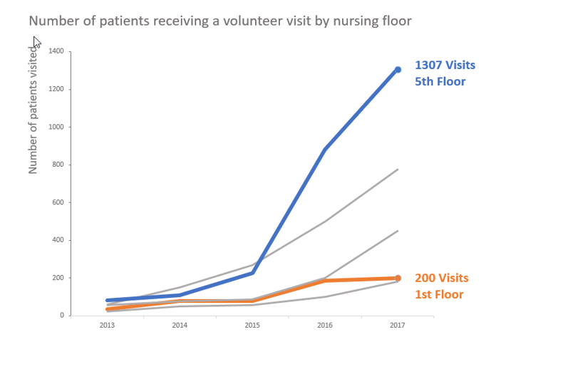
Line graphs are best used for graphing trends over time. Line graphs can be used for single or multiple series.
#4 Area Graph

Area graphs are less commonly used and may be unfamiliar to you. Area graphs are useful if needed to visualize numbers of very significantly varying magnitudes. They can be effective in highlighting a subset.
#5 Scatterplot

Scatterplots are a terrific choice if you are looking to show the relationship between two variables. It allows for the data to be encoded simultaneously so that you can visualize the relationship between the variables.
#6 Simple Text

Simple text is a great option when there are just one or two key numbers to share. Not all data needs to be visualized with a chart or graph.
Likewise, though most data visualizations do involve statistical representations of data, numbers are not the only information with which we work.
#7 Process Map

Process maps are an excellent visualization tool for the sequence of activities or steps that make up a process. Process analysis is made simpler with the creation of a visualization that illustrates the multiple roles and responsibilities involved.
These are seven useful data visualization tools for storytelling. There are additional visualization tools beyond these charts and graphs. You may find that the data you work with is communicated better visually using a table, map, matrix, or even a word cloud. Qualitative data visualizations often fall into one of these realms as the concept under investigation gets operationalized for measurement.
Selecting the right tool to represent your data is an essential step in creating data visualization. The right data visualization tool can serve to highlight insights effectively, even for your own exploratory data consumption. By knowing how each tool can best be used to represent the insights yielded from data analysis, you can select the best tool for its representation. This data visualization guide provides a reference for seven tools that you can put in your toolbox to get the job done to communicate effectively and efficiently with data.

Roseanna Galindo, ECBA, CAVS
Roseanna Galindo is Principal at Periscope Business Process Analysis and a champion for data literacy, the human experience in healthcare, and volunteer leaders everywhere. Learn more about Roseanna and her blog, The Periscope Insighter, by reading the opening post, Venn The Time Is Right.


Comments